Biggest Selection! Fastest Shipping
You name it! We have it! Ensuring fastest of shipping to you. Always

Risk-free Shopping
Ensuring complete satisfaction with all of your payments, both online and offline

Dedicated Support
24/7 with any questions or concerns you have about product around

Quality Product
Assuring that the highest standards are met by each batch that is produced
Blog

Cannabis Packaging Design That Sells — 2026 Trends
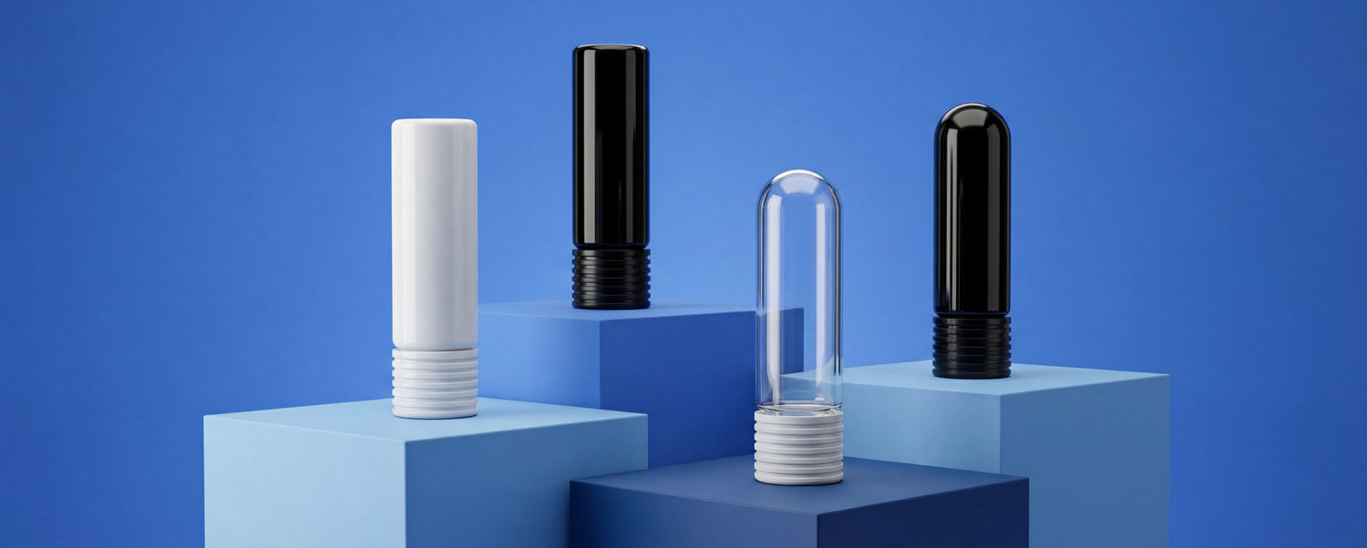
Quick Answer In 2026, cannabis packaging design is about one thing: fitting seamlessly into consumers' lives. The loudest pack doesn't win anymore — the clearest, cleanest, and most considered does. Brands are rejecting outdated stoner tropes in favor of wellness-inspired aesthetics, sustainable materials, and storytelling that positions cannabis as part of a modern lifestyle. Packaging is no longer just a container; it's the "Trojan horse" of cannabis branding — pulling consumers in with beauty and intention, then showing them how cannabis can be part of everyday wellness. Why Packaging Design Matters More Than Ever The global cannabis packaging market was valued at $2.6 billion in 2025** and is projected to reach **$12.8 billion by 2035 — a 17.6% CAGR . In an oversaturated market, the loudest voice doesn't always win. Instead, consumers are gravitating toward clearer, cleaner, and more considered designs . Packaging performs multiple functions: Protects the product Satisfies regulatory requirements Conveys information about safe storage and use Leaves a lasting impression on consumers Today's consumers don't hide their cannabis products anymore. Instead, they want them displayed, integrated, and celebrated. Brands that embrace the design standards of high-end consumer packaged goods (CPG) are finding a powerful edge . As one industry expert puts it: "Packaging is part of the marketing mix, especially in cannabis. Today's consumers aren't choosing brands with packaging that looks like weed. Cannabis is a functional plant that can help you live a more vibrant life." Trend 1: Wellness-Integrated Aesthetic — "Stealth Activism" The Shift Away from Stoner Tropes Cannabis brands are rejecting outdated stereotypes in favor of something more refined, and in turn, more real . According to Angela Pih, founder of Point Brand: "There's still a market for the stoner-bro vibe, but when we think about how to grow the industry, it's about how cannabis fits seamlessly into your everyday lifestyle." The Trojan Horse Effect This is what experts call "stealth activism" — branding cannabis like it has always belonged. It's the Trojan horse effect: pulling people in with beauty, intention, and familiarity, then showing them how cannabis should always have been part of the everyday wellness equation . What this looks like in practice: Packaging that looks like skincare, supplements, or craft beverages Clean, minimalist aesthetics that blend into a nightstand or medicine cabinet No obvious "weed" cues — the brand speaks through quality, not stereotypes Wellness-focused positioning: sleep, anxiety, and pain relief Successful examples: Gem + Jane — packaging that doesn't scream "weed" when you're drinking a can at brunch CAKE She Hits Different — unapologetically feminine, vibrant colors, space-inspired graphics Autumn Brands, Papa & Barkley, Loud+Clear — lifestyle-driven, wellness-integrated approach The goal is normalizing cannabis products through design, storytelling, and thoughtful placement — elevating cannabis from taboo to trusted . Trend 2: Sustainability Sells Why Eco-Friendly Packaging Is Non-Negotiable "Sustainability is a core pillar for many cannabis brands." Consumers increasingly prioritize eco-conscious choices, and brands using recyclable materials and minimal packaging can appeal to environmentally aware shoppers and differentiate in a competitive market . Key sustainability trends: Recyclable materials — paperboard, glass, and biodegradable plastics Reduced packaging — minimizing waste without sacrificing protection Compostable options — plant-based materials gaining traction Hemp-based packaging — moving from novelty to sensible option Real-World Examples CAKE's sustainability initiatives: Updated Designer Distillate packaging decreased paper use by about 70% Decreased plastic use by about 50% Good Supply (Tilray Brands): Transitioned whole flower bags, pre-rolls, and vape tubes to environmentally friendly materials Minimized single-use plastics across their portfolio Consumer Demand In New Jersey, sustainability and values-based choices are gaining traction with customers. "People are starting to ask about recyclable packaging and are drawn to compelling stories around environmentally sensitive practices." Sustainable packaging isn't just about reducing waste — it strengthens brand reputation among eco-conscious customers. Minimalist, clean aesthetics coupled with sustainable materials are becoming hallmarks of effective cannabis packaging design . Trend 3: Storytelling Through Visual Identity Packaging as a Portal to the Brand Great packaging creates a moment, not just a product. It's a tactile invitation into a brand's world and a reflection of the energy behind the product . Whether reflecting sleek minimalism, radiant femininity, or earth-first materials, great design makes consumers feel seen, inspired, and connected. Botanist Jungle: Art Deco Meets Elevated Jungle A powerful example of storytelling through design is Botanist Jungle's rebrand . Drawing on cannabis's geographic lineage, the new look honors regions where original landrace strains emerged: South America, Thailand, and Central Africa. Design elements: A distinct animal anchors each strain category: peacock for Hybrids, pit viper for Indicas, leopard for Sativa Lush layers of monstera leaves, strelitzia, plantain, and spathiphyllum blossoms Art Deco meets elevated jungle aesthetic — geometric patterning and hand-drawn illustrations Gold-foil accents and deep, jewel-toned palette "The original packaging was functional but lacked emotional connection and visual depth. Now, Art Deco meets an elevated jungle aesthetic... It feels storied without being nostalgic. Wild, yet intentional." CAKE: Vibrant, Feminine, Unapologetic CAKE's packaging is a statement that sets the tone for the entire experience. Co-founder Chloe Kaleiokalani explains: "For me, packaging is so much more than a container; it's a statement that sets the tone for the entire CAKE experience. And I want that statement to spark joy, curiosity, even a little thrill before our customers touch the product." The brand's visual identity is unapologetically feminine, boldly setting products apart in an industry overrun with masculine cues . Lowell Herb Co: Vintage-Inspired Authenticity Lowell Herb Co has built a phenomenal brand with packaging at its very heart. The vintage-inspired artwork nods to a historical connection to their fictional namesake, farmer "William 'Bull' Lowell." The box is high quality, and the brown kraft material has the feel of an artisan product . Houseplant: Bold, Collectible, Reusable Houseplant's rebrand features a clear, fun visual identity based around bold colors and simple, striking typography. There's also a clever level of collectability around the stackable custom tins and boxes. "The packaging can be retained and reused, something that's out on display at home long after purchase, which also results in long-term brand exposure." Trend 4: Minimalism and Clean Aesthetics Less Is More In a crowded market, minimalism is winning. Consumers gravitate toward clean, simple designs that communicate sophistication without overwhelming visual noise. This is particularly effective for brands targeting wellness-focused consumers and the "canna-curious." What minimalist design looks like: Neutral colors — whites, creams, soft earth tones Clean lines and refined typography Limited text — focus on essential information High-quality materials that feel premium in hand The "One Metre Test" If shoppers can't read your pack from 1.2 metres away in 3 seconds, you've lost them. This means compliance information and branding both need to be immediately legible. Color Psychology in Cannabis Packaging Color coding is becoming an industry standard: Green — Low THC, entry-level products Amber — Medium potency Red — High potency, premium offerings Some brands are using distinctive color palettes to stand out, like CAKE's vibrant, feminine hues or Botanist Jungle's jewel-toned palette. Trend 5: Compliance as a Design Opportunity Making Regulations Look Intentional In 2026, compliance is no longer an afterthought — it's a design constraint that creative brands are using to their advantage. The child-resistant moment shouldn't feel like punishment; it should be designed for dry hands and older customers. Smart compliance design: Warning labels that look intentional rather than slapped on Child-resistant mechanisms that are intuitive for adults Tamper-evident features that add security without compromising aesthetics Integration of labeling requirements into the overall design As one expert notes: "Packaging is a highly regulated area where accuracy and transparency are non-negotiable." But that doesn't mean it can't be beautiful. The Child-Resistant Moment Child-resistant packaging features must meet regulatory requirements while ensuring ease of use. Innovations include push-and-turn closures, resealable pouches, and tamper-evident seals . The key is designing for both safety and usability: "It's designed for dry hands and older customers" — not just compliance checkboxing. Trend 6: Smart Packaging and Digital Integration QR Codes, NFC, and Traceability Smart packaging solutions are enhancing consumer engagement by providing product traceability, dosage guidance, and authentication features . Brands are integrating: QR codes linking to lab reports and product details NFC-enabled labels for interactive experiences Authentication features to combat counterfeiting Track-and-trace capabilities for regulatory compliance Why it matters: Builds consumer trust through transparency Provides educational content without cluttering the package Enables direct-to-consumer engagement Supports regulatory compliance Trend 7: The Rise of Luxury and Premium Packaging Premium Products Demand Premium Packaging As premium cannabis brands proliferate, demand for luxury packaging solutions has grown significantly . High-end materials and finishes signal quality before the consumer ever tastes the product. Luxury packaging elements: Gold-foil accents — like Botanist Jungle's packaging Soft-touch finishes — velvety textures that feel premium Magnetic closures — satisfying opening experience Custom shapes — distinctive silhouettes on the shelf Embossing and debossing — tactile engagement The Unboxing Experience As unboxing culture continues to thrive, so does the importance of creating a moment, not just a product. "Today's cannabis consumers are curating their lives with intention: seeking brands that echo their values, elevate their rituals, and bring a little beauty to the everyday." How to Apply These Trends to Your Brand 1. Know Your Consumer "Try to think about it from the context of who your consumer is and what they're looking to solve when they're shopping. Then, you can position your brand as one that really understands them and their needs." 2. Start with Compliance, Then Layer in Design Always start with child-resistance, tamper-evidence, and labeling requirements. Then layer in creative design that makes compliance features look intentional. 3. Choose Your Materials Wisely Your material choices communicate your brand values: Paperboard/Kraft — Artisanal, sustainable, authentic Glass — Premium, quality-focused, eco-friendly Plastic — Practical, cost-effective, versatile Hemp-based — Innovative, sustainable, forward-thinking 4. Tell a Story Every design element should tell your brand's story — from color choices to typography to materials. "Packaging has become a strong emotional touchpoint for consumers, and brands are listening." 5. Think About the Afterlife "The packaging can be retained and reused, something that's out on display at home long after purchase, which also results in long-term brand exposure." Design packaging that consumers want to keep. 6. Test in Real-World Conditions Put your packaging on actual dispensary shelves and test it with real consumers. Make sure your label is legible from 1.2 metres away and that the child-resistant mechanism works for adult users. Why Choose PackTHC At PackTHC, we understand that packaging is a cornerstone of consumer trust, brand identity, and regulatory compliance . Our comprehensive product range supports every design trend: Child-Resistant Solutions — Pop-top vials, pre-roll tubes, CR zipper bags Sustainable Options — PCR plastics, recyclable materials, paperboard packaging Premium Formats — Glass jars, custom boxes, luxury finishes Custom Printing — Digital and offset printing for every volume Compliance Expertise — All products meet PPPA and ASTM standards Final Takeaway: Design That Sells In 2026, winning cannabis packaging design is about integration, not differentiation for its own sake. The brands that succeed are those that view packaging not as a cost center but as a creative opportunity — a vehicle for storytelling, sustainability, and soul . Key design principles for 2026: Wellness-integrated aesthetics — Position cannabis as part of a healthy lifestyle Sustainability — Consumers demand eco-friendly choices Storytelling — Packaging should communicate your brand's values Minimalism — Clean, clear, and considered designs win Compliance as opportunity — Make regulations look intentional Smart integration — QR codes and NFC enhance engagement Premium materials — Quality packaging signals quality product "When done well, packaging becomes a quiet form of advocacy for the plant, the planet, and the people who experience cannabis with purpose." FAQ What cannabis packaging designs sell best in 2026?Wellness-inspired, minimalist designs with sustainable materials are winning. Brands that position cannabis as part of a healthy lifestyle and use clean, considered aesthetics are outperforming those using outdated stoner tropes . How important is sustainability in cannabis packaging?Very. Consumers increasingly prioritize eco-conscious choices. Brands using recyclable materials and minimal packaging can appeal to environmentally aware shoppers and differentiate in a competitive market . What is "stealth activism" in cannabis packaging?A strategy where cannabis is branded like it has always belonged — using designs that blend in with everyday products like skincare, supplements, or craft beverages. This helps normalize cannabis as part of a modern lifestyle . How can I make my packaging stand out on dispensary shelves?Use the "one metre test" — make sure your brand is immediately recognizable from a distance. Consider distinctive colors, premium materials, and storytelling that connects emotionally with consumers . What's the role of QR codes in cannabis packaging?QR codes enhance consumer engagement by providing product traceability, dosage guidance, lab results, and authentication features without cluttering the physical package . Are consumers actually looking for sustainable cannabis packaging?Yes. In states like New Jersey, customers are actively asking about recyclable packaging and gravitating toward brands with compelling sustainability stories . What are the biggest cannabis packaging design mistakes in 2026?Using outdated stoner stereotypes, prioritizing style over compliance, using non-recyclable materials, and failing to tell a cohesive brand story through packaging
Read moreWhy Packthc Wins Every Time
Stop overpaying, missing deadlines, and risking brand damage.
Get My Instant Quote Now| PackTHC Packaging | Cheapest supplier | "Premium" local print | 3rd party companies | |
|---|---|---|---|---|
| Price | ✓ | ✓ | ✕ | ✕ |
| Speed | ✓ | ✕ | ✕ | ✕ |
| Quality | ✓ | ✕ | ✓ | ✕ |
| Compliance | ✓ | ✕ | ✓ | ✕ |
| Risk-Free | ✓ | ✕ | ✕ | ✕ |